
Momentr (Full Case Study)
Modernizing group trip planning with a mobile app
built for collaboration, clarity, and seamless decision-making.
ROLE
UI/UX Designer (Solo Project)
SKILLS
Competitive Analysis
User Research
Information Architecture
Prototyping
Usability Testing
TIMELINE
6 months
Coordinating travel with friends can quickly become a stressful experience. The joy of the trip is often overshadowed by the complexities of planning — and the process can feel overwhelming and take away the excitement of traveling together.
Why this matters
A long-running Harvard study on adult development, summarized by its current director Robert Waldinger, found that strong social connections are one of the most significant contributors to long-term happiness and health. (Mineo, 2017)
35%
Post-covid, we are noticing a strong resurgence of group traveling, with a 35% rise in bookings for groups of eight or more, as people increasingly seek meaningful shared experiences - whether through multigenerational vacations, food-focused trips, or outdoor adventures (Apse, 2025).
What tools are already out there
I conducted a heuristic analysis of popular trip planning tools to evaluate how well they balance customization, information hierarchy, and user engagement. I focused on four key heuristics:
Visibility of system status
User control freedom
Flexibility + efficiency of use
Visual design
Key Observations

Apps like TripIt and Wanderlog gate features behind early paywalls, discouraging users from completing onboarding.
Excessive customization and feature options lead to decision fatigue, slowing down the planning process.

Tools like Excel and Google Sheets prove effective for trip planning, leveraging existing mental models.

What I wanted to know from users
1
What tools/methods do people currently use to plan group trips, and what aspects of those tools work well or fall short?
2
What factors do people consider when determining if someone is a good travel companion?
3
How do people perceive and experience shared decision-making when planning trips with friends?
4
What pain points or challenges are commonly overlooked when planning trips with friends?
What users shared
I surveyed 26 participants to capture quantitative data on travel habits and the pain points of group coordination. From there, I conducted 5 in-depth interviews focused on recent or upcoming trips to understand planning behaviors, tool usage, and key friction points.

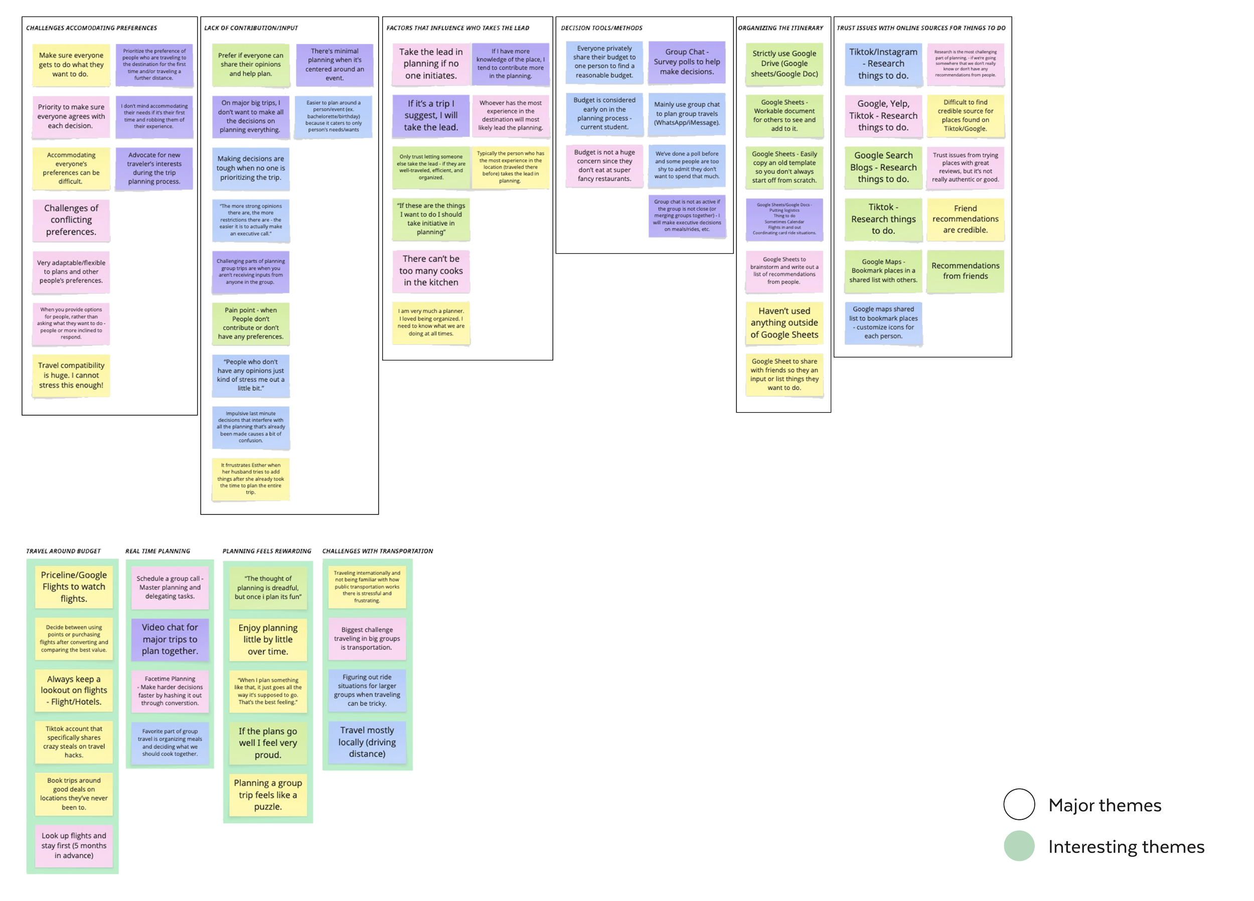
What themes emerged
Recurring themes emerged as I created this affinity map.
Challenges Accommodating Different Preferences
Lack of Equal Contribution/Input
Distrust of Online Sources
Managing Budget Constraints
Existing Decision-Making Tools/Methods

OPPORTUNITIES
How might we make it easier for everyone to communicate their preference and expectations early in the planning process?
How might we ease the burden on group planners by distributing tasks and decisions more collaboratively?
User roles and goals
PAIN POINTS
GOALS
(MVP)


Carrying the weight of making big decisions alone.
Navigating unclear preferences and last-minute changes.
Reach group consensus on decisions.
Get input from everyone.
Delegate tasks among the group.
Managing low group commitment.
Getting little to no group participation.
Share suggestions easily.
See what tasks need to be done.
Vote on group decisions.
THE LEADER
THE CONTRIBUTOR
THE PARTICIPANT
Overwhelmed by too many notifications.
Doesn't want to plan every detail.
Keep up with essential details only.
Get notified when input is needed.
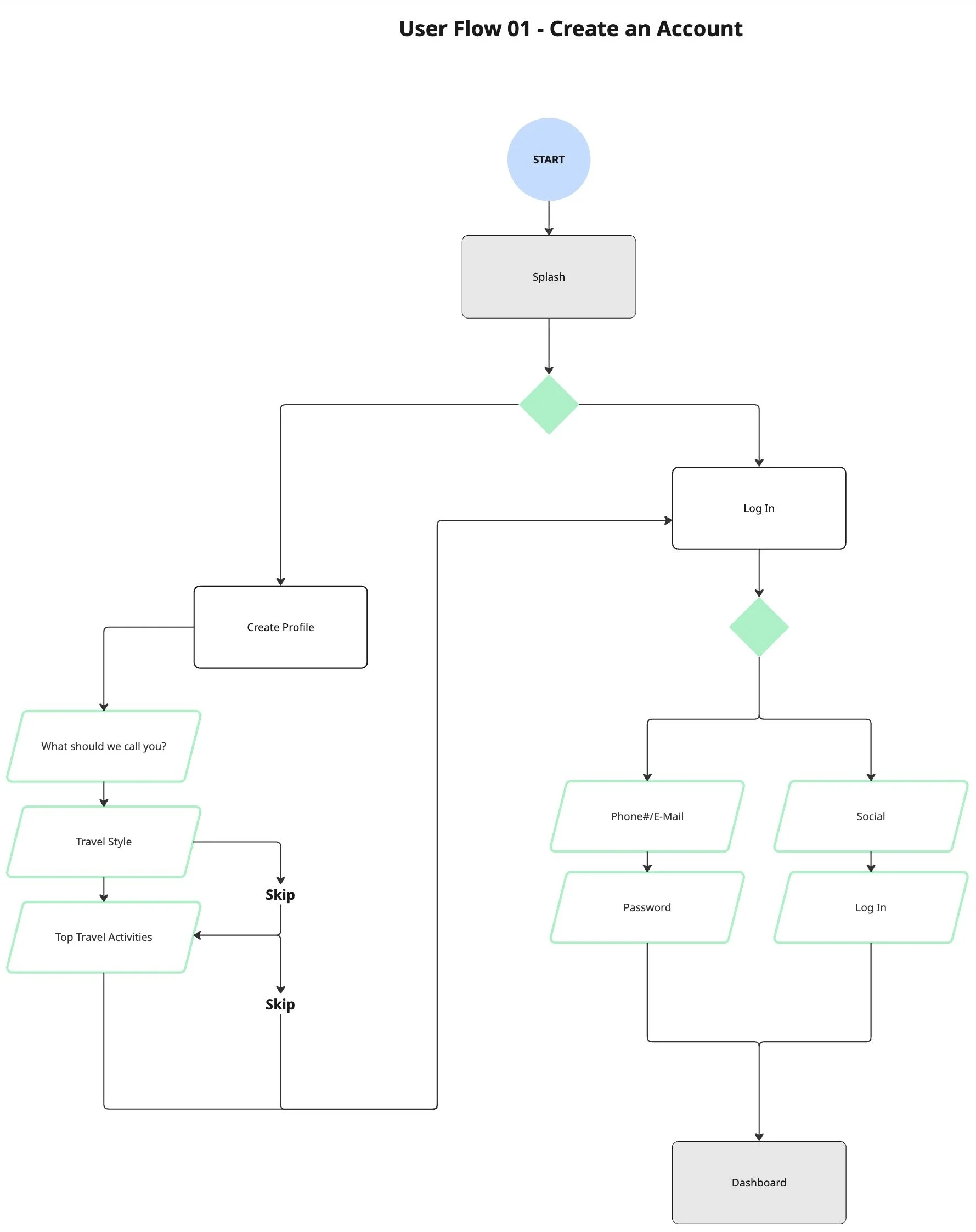
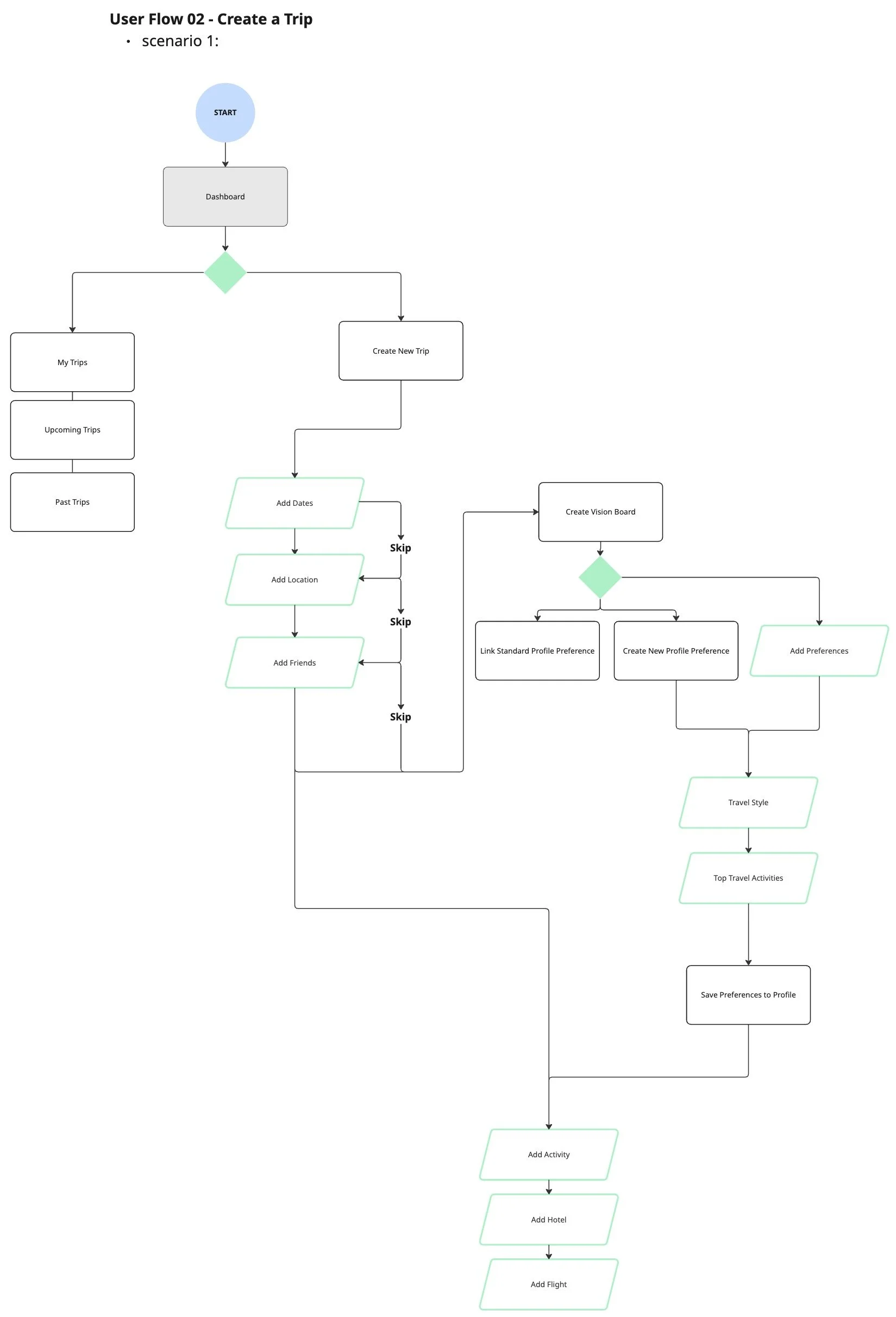
User Flows
I designed the user flow around two core experiences: account creation that captures travel preferences upfront, and trip creation that facilitates early alignment and group input.
Throwing my ideas on paper
Breaking down my solutions into quick sketches.
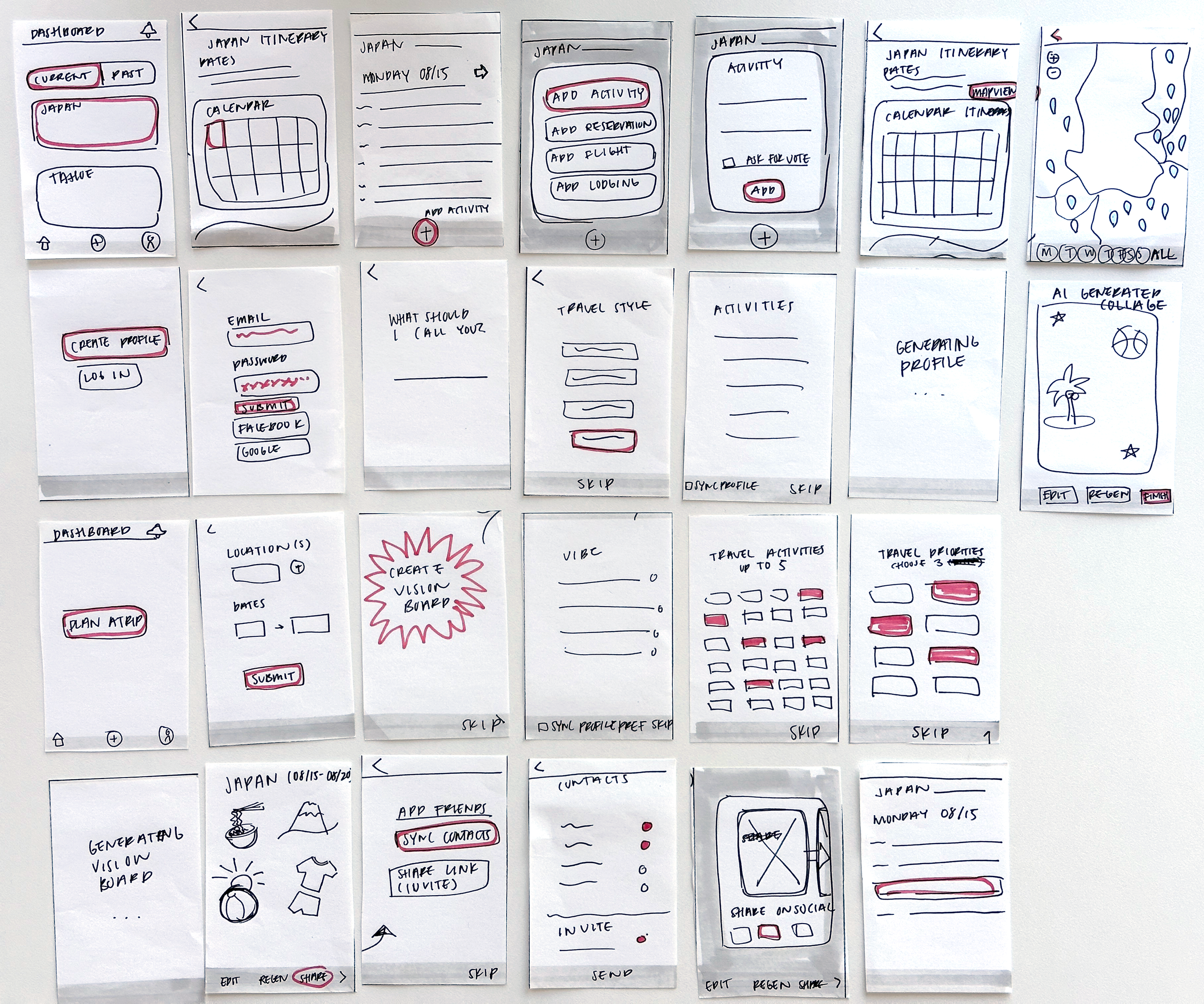
Mapping the screens
Used low-fidelity wireframes to establish structure and validate early solutions.

Curating the visual identity
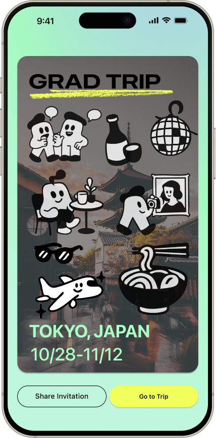
Momentr reimagines group travel planning as playful and collaborative, moving beyond spreadsheets toward a dynamic, visually rich experience. Drawing from scheduling app layouts and poster graphics, the design feels expressive, intuitive, and designed to build excitement.


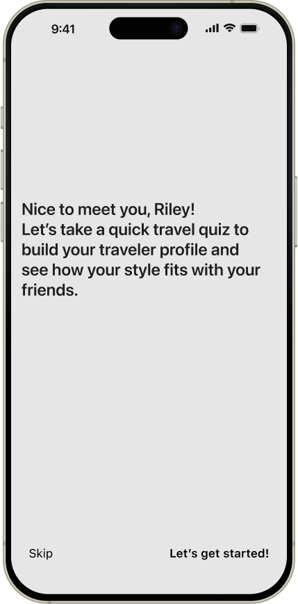
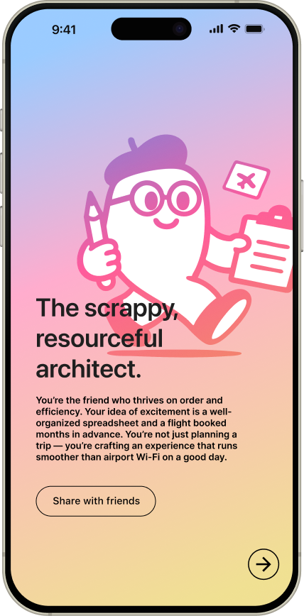
Personalized travel profile
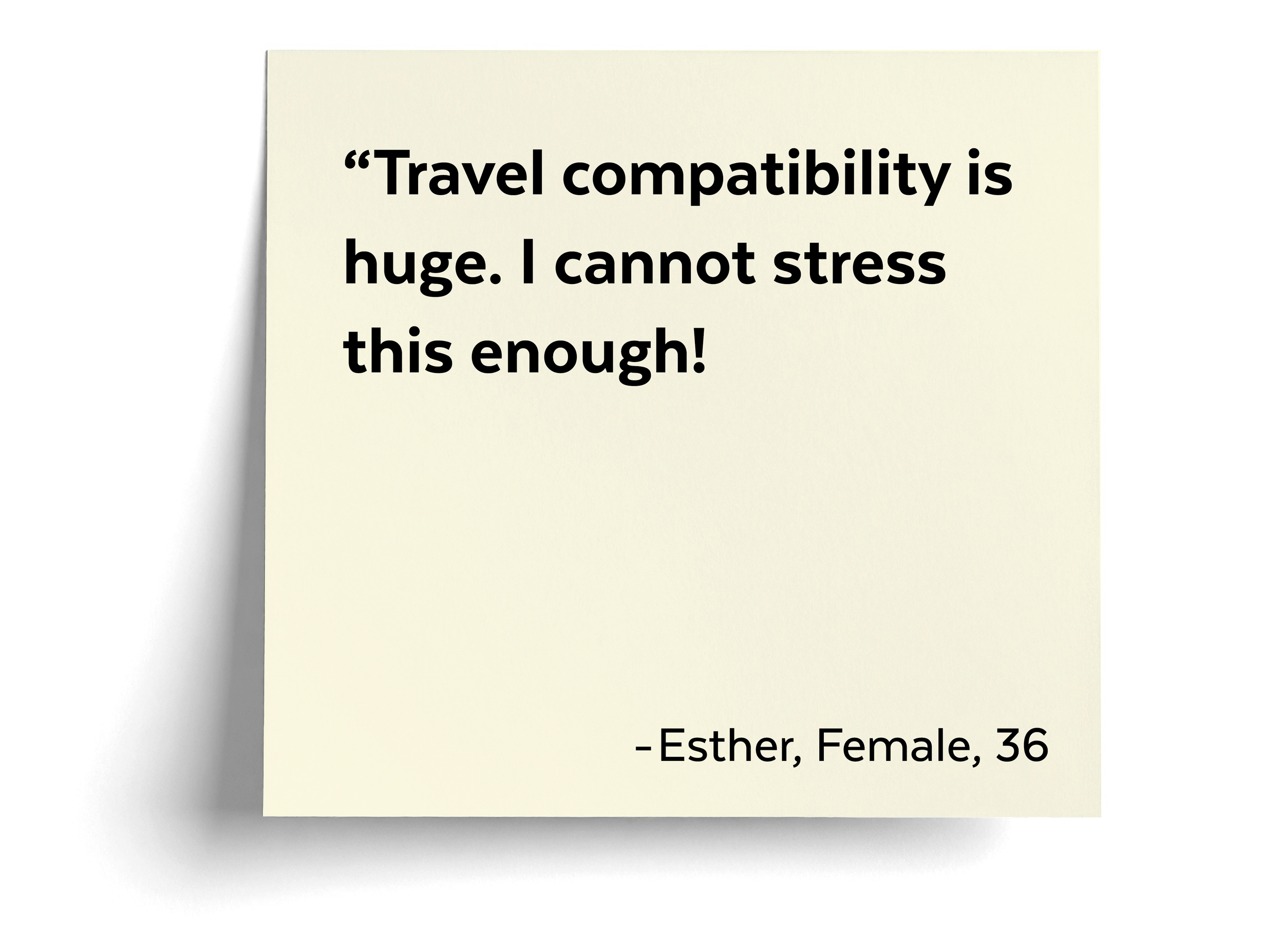
Users begin with a travel quiz to determine their archetype. These insights inform personalized planning, highlight travel compatibility within the group, and help establish alignment from the outset.
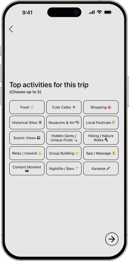
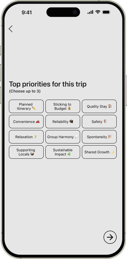
Empowering personal input
To establish clear preferences early, users are prompted to select their top priorities and activities before moving forward with planning.
AI-generated vision board
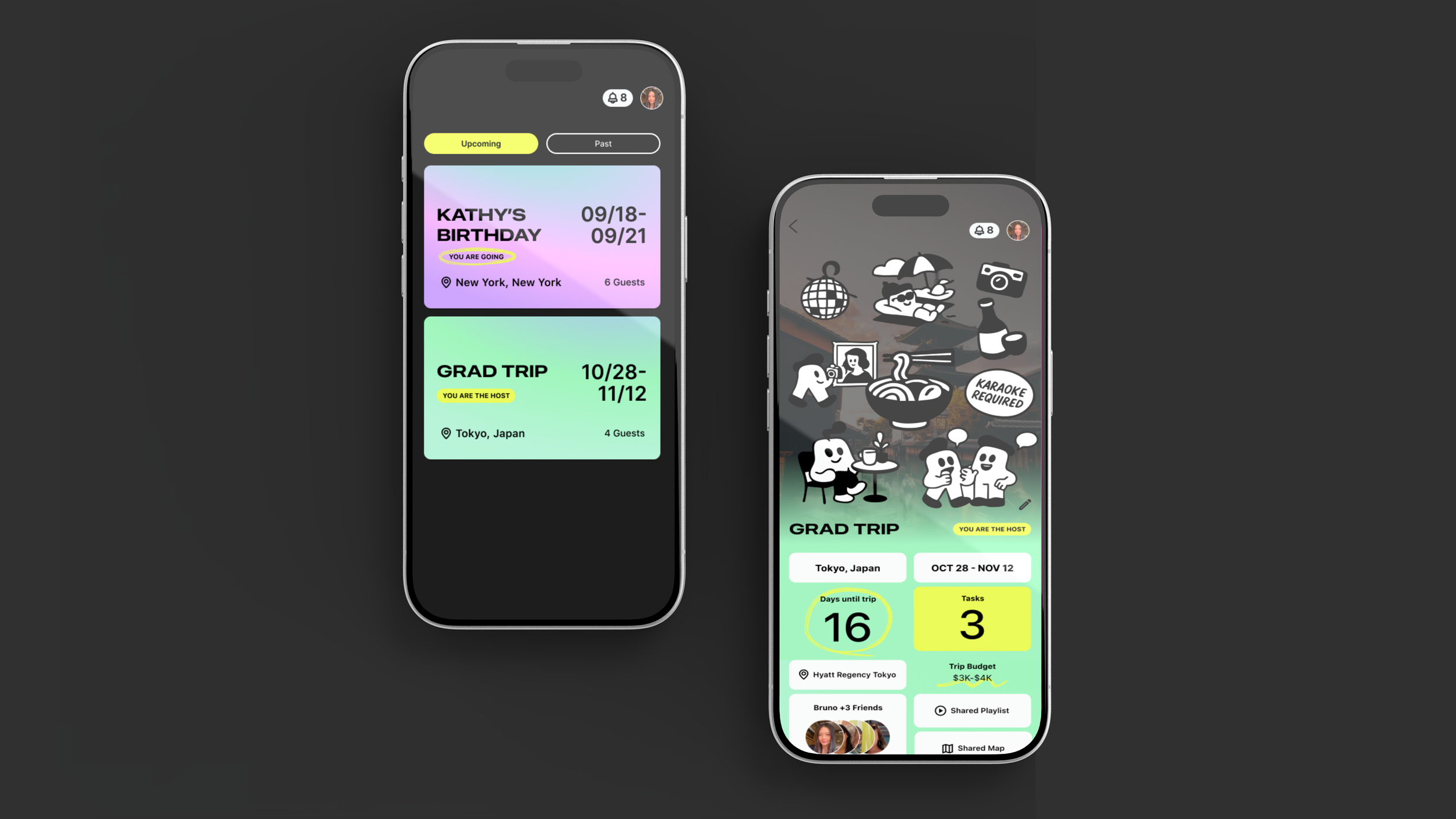
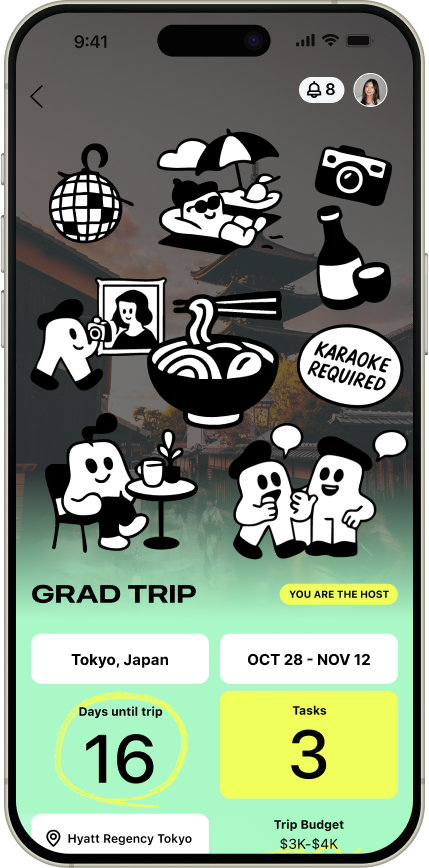
To maintain alignment throughout planning, I introduced an AI-generated vision board that aggregates the group’s preferences into a vision board. The visual updates dynamically as members join and is anchored at the top of the dashboard to continuously reinforce the group’s shared goal.
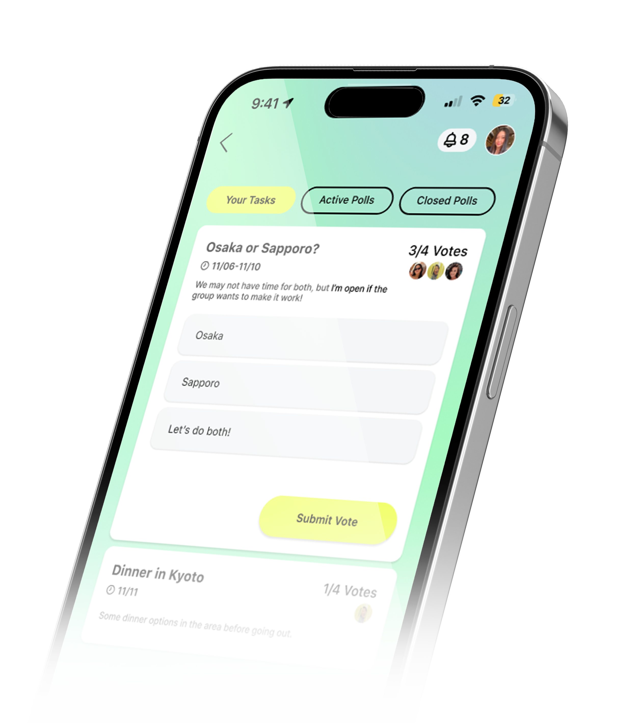
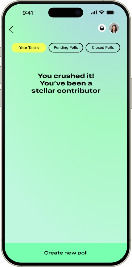
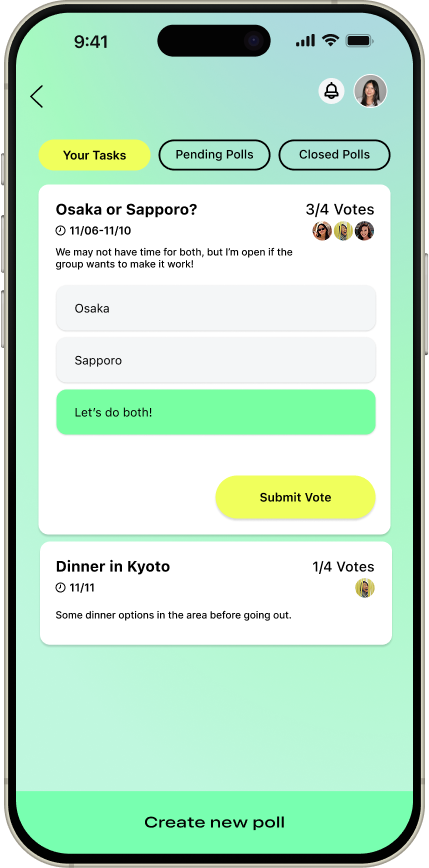
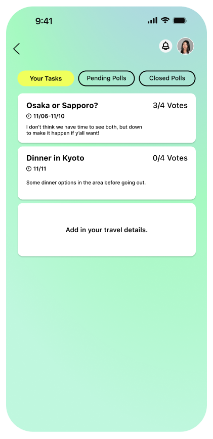
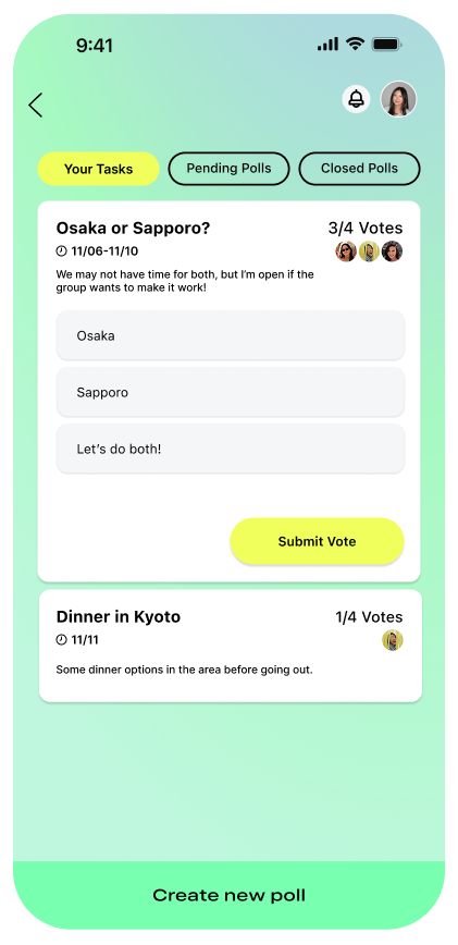
Assigned Tasks
Present individually assigned tasks in a visible way to increase transparency around upcoming decisions and ensure all members can contribute feedback.
Testing with real users
Is onboarding clear and engaging?
Are collaborative features intuitive?
Can users easily set preferences?
Are key details visible and accessible?
Does the experience feel valuable?
Here's what I asked them to do
Complete onboarding by creating a trip profile.
Create a new group trip.
Complete your assigned tasks
Add a poll to the group trip.
What I learned from users
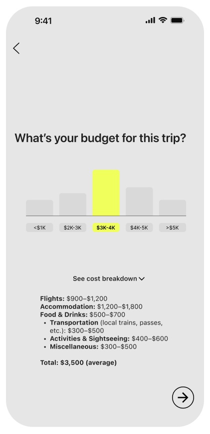
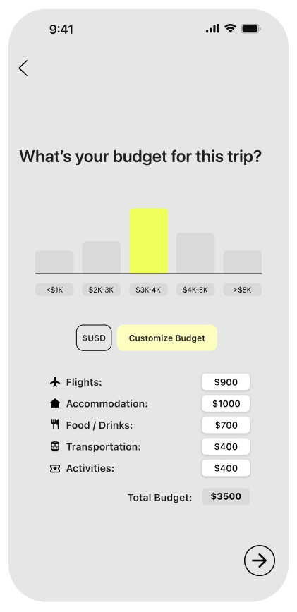
While this version shows the breakdown of the cost, Users wanted more opportunities for personalization and customization.
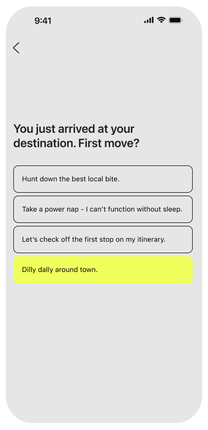
Users paused to understand how to begin or complete the task due to a lack of clear entry points.
Users expected poll creation to occur on this page.
Each screen required tapping the next arrow, which created unnecessary friction and slowed down the flow.
How I updated the design
I enabled manual budget calculation so users could define realistic spending limits.
To reduce friction and help users get started, I opened the first task by default.
A clear CTA was added to the bottom to support creating a new poll.
I built momentum by automatically progressing to the next page when users select their answers.
Closing Thoughts
Group decision-making proved more nuanced than I anticipated; balancing diverse travel preferences and personalities required thoughtful, deliberate design choices.
Users strongly resonated with personal travel profiles, allowing opportunities to explore compatibility matching and strength-based task delegation in future iterations.
Customization requires balancing flexibility with simplicity to prevent cognitive overload. Future iterations could introduce a more robust onboarding experience to gradually educate users on the platform’s full feature set.